DECODING ALBUM COVER
- mohit Chand
- Feb 17, 2022
- 2 min read
Listening to music has always been a huge part of my identity. It has been my route to find myself and escape from people. So as a way to express my love and to also understand the correlation between the Album cover of an Artist to the songs in it. To make my task easier I only took the first song of the album to derive to the relationship.
I’ll firstly break down the album cover art, then the first song in that album, and finally, give my views on why it’s the best-chosen song.
PS: All the credits/links for images and audio references are given at the end of this blog.
ALBUM I – TROYE SIVAN’s BLUE NEIGHBOURHOOD
Release year – 2015

VISUAL AESTHETICS
A) Colour
Hues- White, Blues, and a little bit of red complete the art
Value – Toward the dark end
Intensity- Somewhere between Medium to a little less than high
B) Lines – The horizon is divided by the sunset red the background.
C) Space – The space division has 30% covered by the man (Troye Sivan) and rests by the background (houses, sky, and clouds)
AUDITORY AESTHETICS
The first song of the album is named “WILD”
A) TEMPO – Medium
B) PITCH – Medium
C) DENSITY – Thin
D) ARTICULATION – Staccato
E) RHYTHM – Regular
This album has been in my heart ever since I have heard it. The first song Wild fits perfectly with the album cover with the song due to the regularity in beats. The blue in the title is referred to as depression/ feeling sad here the density being thin also makes complete sense.
ALBUM II – HARRY STYLES’s FINE LINE

Release year – 2019
VISUAL AESTHETICS
A) Colour
Hues- Pinks, blues and white
Value – Mostly light
Intensity- Towards the duller end
B) Lines – Curves complete this image
C) Space – The space division is firstly done in a way where the perspective is of a door peephole. The image inside the circle has elongated lines.
AUDITORY AESTHETICS
The first song of the album is named “Golden”
A) TEMPO – Fast
B) PITCH – Medium
C) DENSITY – Thin
D) ARTICULATION – Staccato
E) RHYTHM – Regular
This album was my lockdown mantra. The first song “Golden” portrays a free-spirited vibe that aligns with the curves in the cover art.
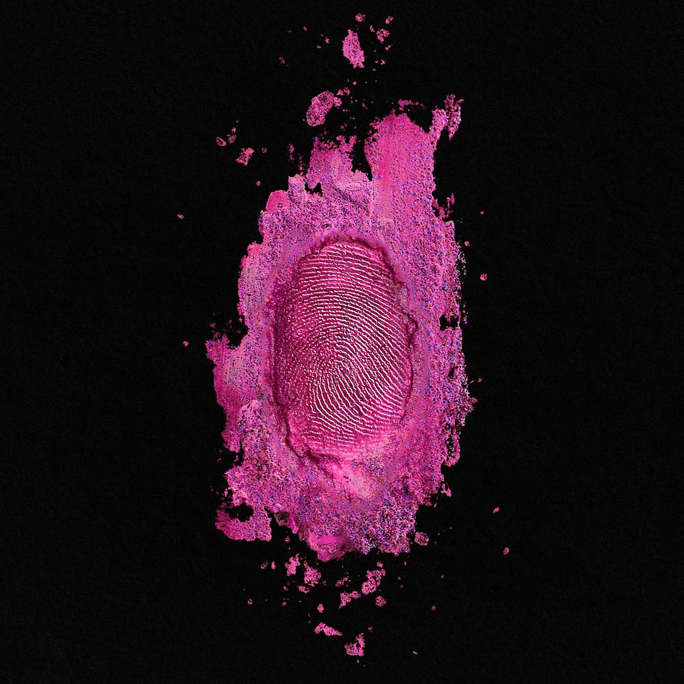
ALBUM III – NICKI MINAJ’s THE PINKPRINT (DEXULE EDITION)

Release year – 2014
VISUAL AESTHETICS
A) Colour
Hues- Pink and black
Value – Toward the dark end
Intensity- Medium to high
B) Lines – The lines are not straight and are completed with many small curves inside the print.
C) Space – The vertical division is created by the fingerprint and the paint spread on the same axis. The space division has 30-40% covered by the fingerprint and rests with the solid black background.
AUDITORY AESTHETICS
The first song of the album is named “All things go”
A) TEMPO – Medium
B) PITCH – Medium
C) DENSITY – Medium to thick
D) ARTICULATION – Staccato
E) RHYTHM – Regular
The Pinkprint album is a very personal rap album by Nicki Minaj. This album having All things go as the first song with the density shifting due to rapping ,then singing in the chorus portrays the mood of the album cover where the paint in the bottom covers a small region then expands and then finally contracts on the top.
These albums portray good story writing and lyrics with appropriate album cover and music to set the mood/emotion.
CREDITS
SONGS
WILD
https://www.youtube.com/watch?v=3awzvNrKDsg
GOLDEN
https://www.youtube.com/watch?v=P3cffdsEXXw
ALL THINGS GO
https://www.youtube.com/watch?v=Wk_LhCGEQws&list=PLTfO7IRJ-B3Au04IARgRsX_QVGngeQo1m&index=1
ALBUM COVER


Comments